|
I integrated technologies by using both Word and Canva when designing my magazine cover, table of contents, and double page spread. When I was designing my magazine cover, I used Word. Using this program was exceedingly difficult because the image that I wanted to use as the background would cover the text that I added, as well as it was nearly impossible to space my text evenly since there were no guides on the page to help with placement. The other program I used when designing my magazine table of contents and double page spread was Canva. I liked using Canva because it allowed me to place items evenly on the page with their guides. Not only that, but it allowed me to change the background colors and designs with ease. For hardware, I used my iPhone 8 alongside my father’s Google Pixel phone to take the pictures. My phone’s camera quality was worse than my father’s, so I decided to use my father’s phone for the majority of the project. I also completed all my editing using Canva on my Dell laptop. For the online aspect, I used Google Images to research other food magazines and what kind of pictures I wanted to take for my magazine.
0 Comments
My production skills have developed during this project through a greater understanding of colors as well as how to use fonts appropriately. My color understanding has increased because before, I did not know how to properly choose colors that complemented each other to make a beautifully designed magazine. However, now I know all about analogous, monochromatic, split complimentary, and double split complimentary colors, and how to properly implement them to make a professional looking magazine. Also, before I did not understand that having many different fonts on a document or on my magazine was extremely distracting, but now I understand that you have to choose one to two different fonts for a document or magazine so that it looks professional and organized. Not only that, but I also learned how to use Canva. Canva was a wonderful website that showed many different templates for how a magazine was supposed to look and allowed you to edit them to make them your own. Through the use of this website, I realized the importance of organization when creating your final magazine. Not only that, but I also learned valuable skills that I use in my daily life now, after the production of the magazine. One of the skills I learned is how to manage my time wisely. Every time I was given a deadline, I would plan my week accordingly to allot myself enough time to create a quality product in a timely fashion. In the beginning of the week, I would take my pictures and brainstorm how I wanted my product to look. Then, I would work on the magazine itself and tweak it until I thought it was perfect. I always completed my work the day before it was due and turned it in. I also improved my writing skills as well. I have never been confident of my writing, but now, after working on the magazine for so long, I learned how to properly format sentences and now I am not so scared of writing in daily life.
My product engages with the audience who are foodies and people who like to try and/or make new food by showcasing appealing desserts that one would want to eat. This would cause the reader to want to buy the magazine because they are interested in what the dessert is, and they will want to follow the recipe so they will have the ability to enjoy the dessert. This will cause the reader to understand that you do not need to be a chef to make these desserts, but a person who has the time and the money to make them.
My product will be distributed as a real media text as a printed magazine. I will send my magazine to an online printing service (i.e. Printingcenterusa.com) to have them print copies so that I can distribute them. The printed magazine will then be distributed in stores, so a large variety of people can see and buy the magazine. Another option to obtain my magazine is to go directly to my website to gain a subscription, $19.74 a month, so that the magazine can be sent directly to their home. Because the pandemic has caused all of us to stay home, having a website will be extremely helpful for those people who want to bake the recipes in my magazine, but who do not want to leave the house to purchase a copy at the store. My product engages with the audience who are foodies and people who like to try and/or make new food by showcasing appealing desserts that one would want to eat. This would cause the reader to want to buy the magazine because they are interested in what the dessert is, and they will want to follow the recipe so they will have the ability to enjoy the dessert. This will cause the reader to understand that you do not need to be a chef to make these desserts, but a person who has the time and the money to make them. My product will be distributed as a real media text as a printed magazine. I will send my magazine to an online printing service (i.e. Printingcenterusa.com) to have them print copies so that I can distribute them. The printed magazine will then be distributed in stores, so a large variety of people can see and buy the magazine. Another option to obtain my magazine is to go directly to my website to gain a subscription, $19.74 a month, so that the magazine can be sent directly to their home. Because the pandemic has caused all of us to stay home, having a website will be extremely helpful for those people who want to bake the recipes in my magazine, but who do not want to leave the house to purchase a copy at the store.
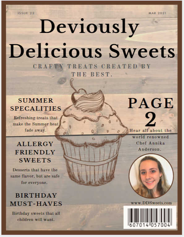
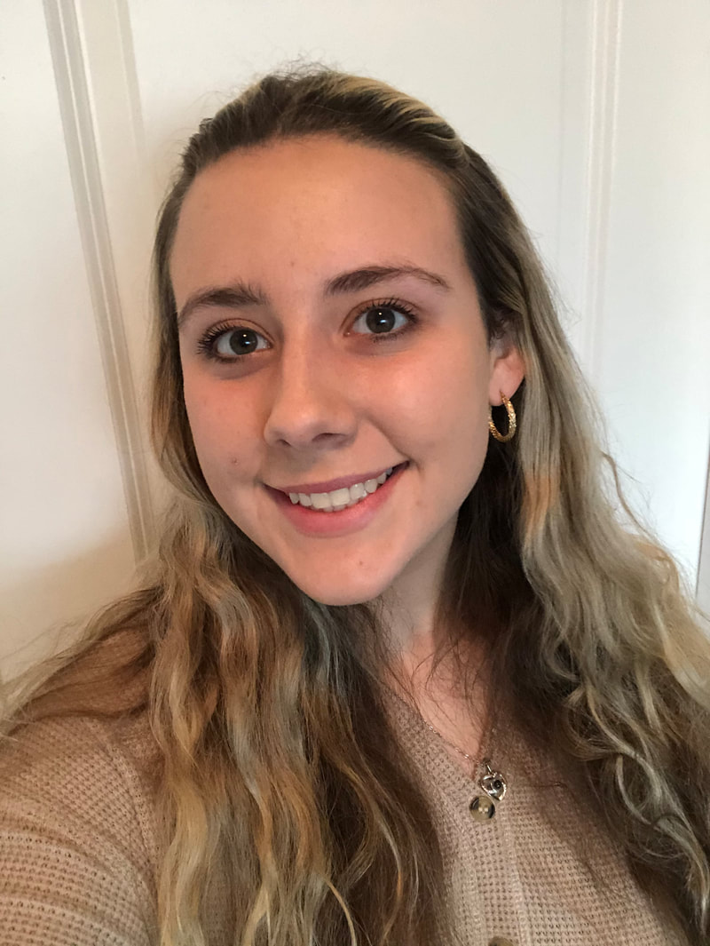
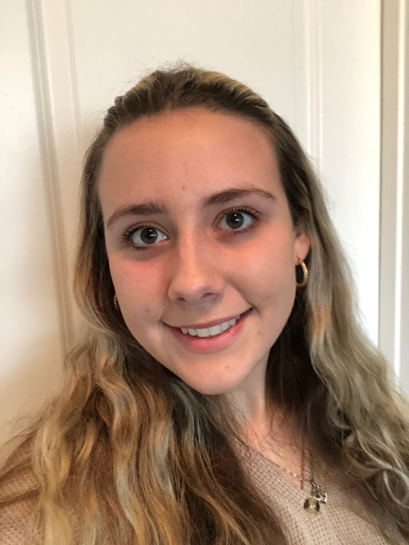
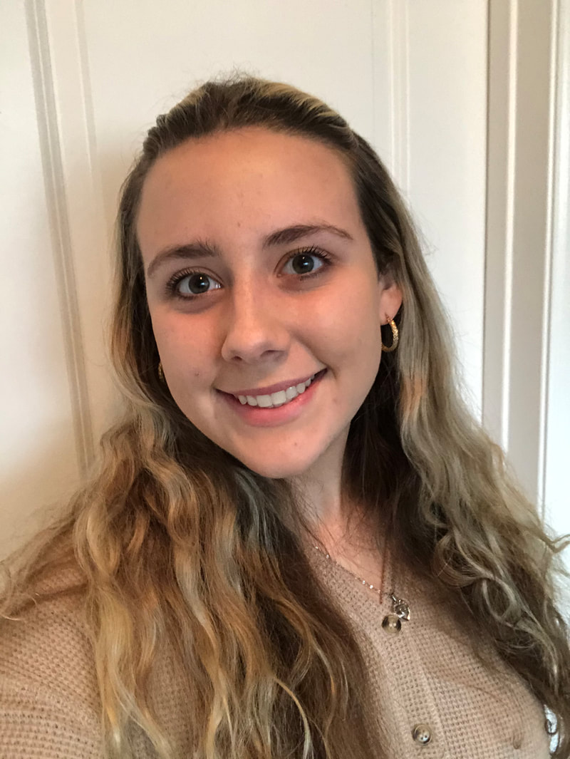
Final Cover:
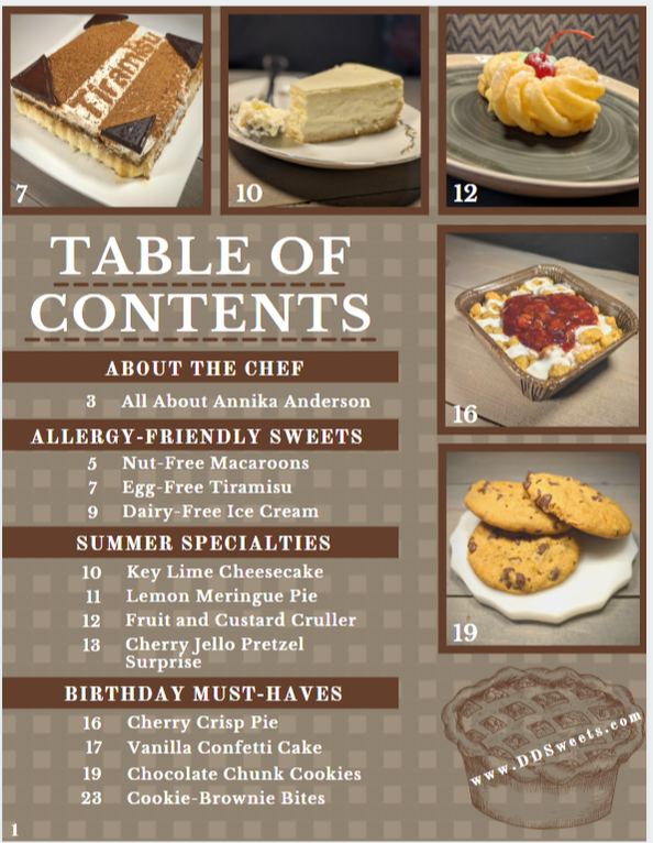
Final Table of Contents:
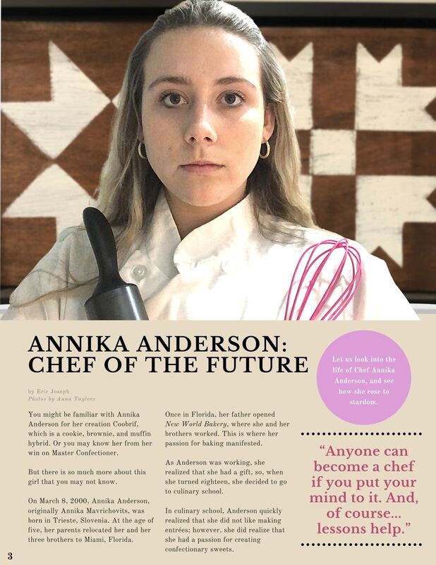
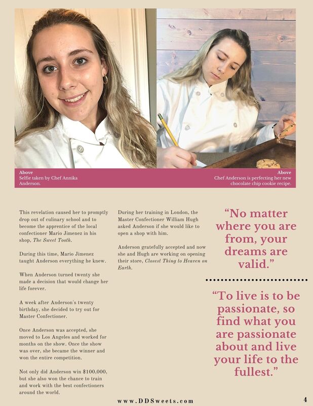
Final Double Page Spread:
For this revision I decided to take a more traditional approach. With the original double page spread, I constructed a recipe with step-by-step instructions. I realized that I did not want to continue this idea and scrapped it and decided to make a more traditional double page spread. I created a full-length article discussing a fictional person, Annika Anderson, which included her pictures and some of her quotes. I believe that this looks more professional and a better option for the double page spread. The article is completely made up and the people discussed within it are fictitious as well. I modeled Annika Anderson and took photos of myself and placed them on the double page spread since we are in a pandemic and I wanted to be as safe as possible.
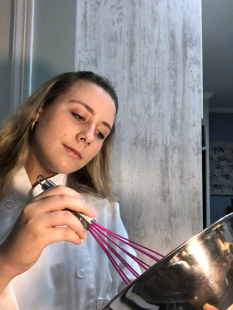
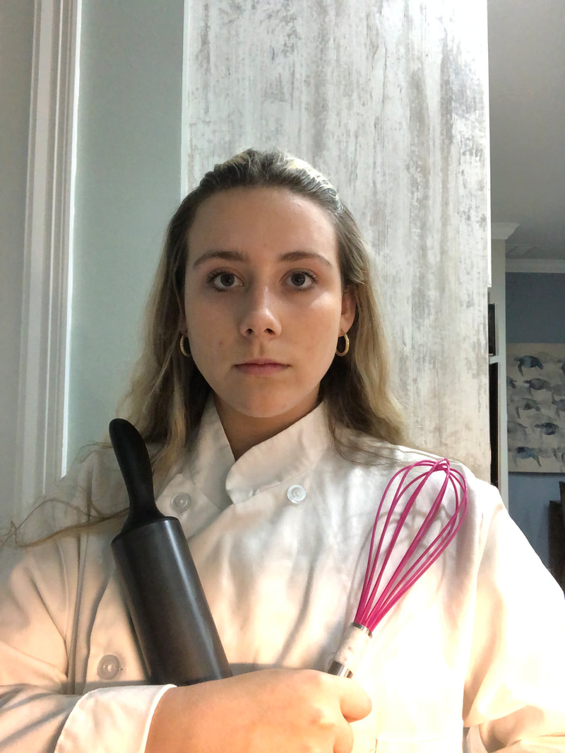
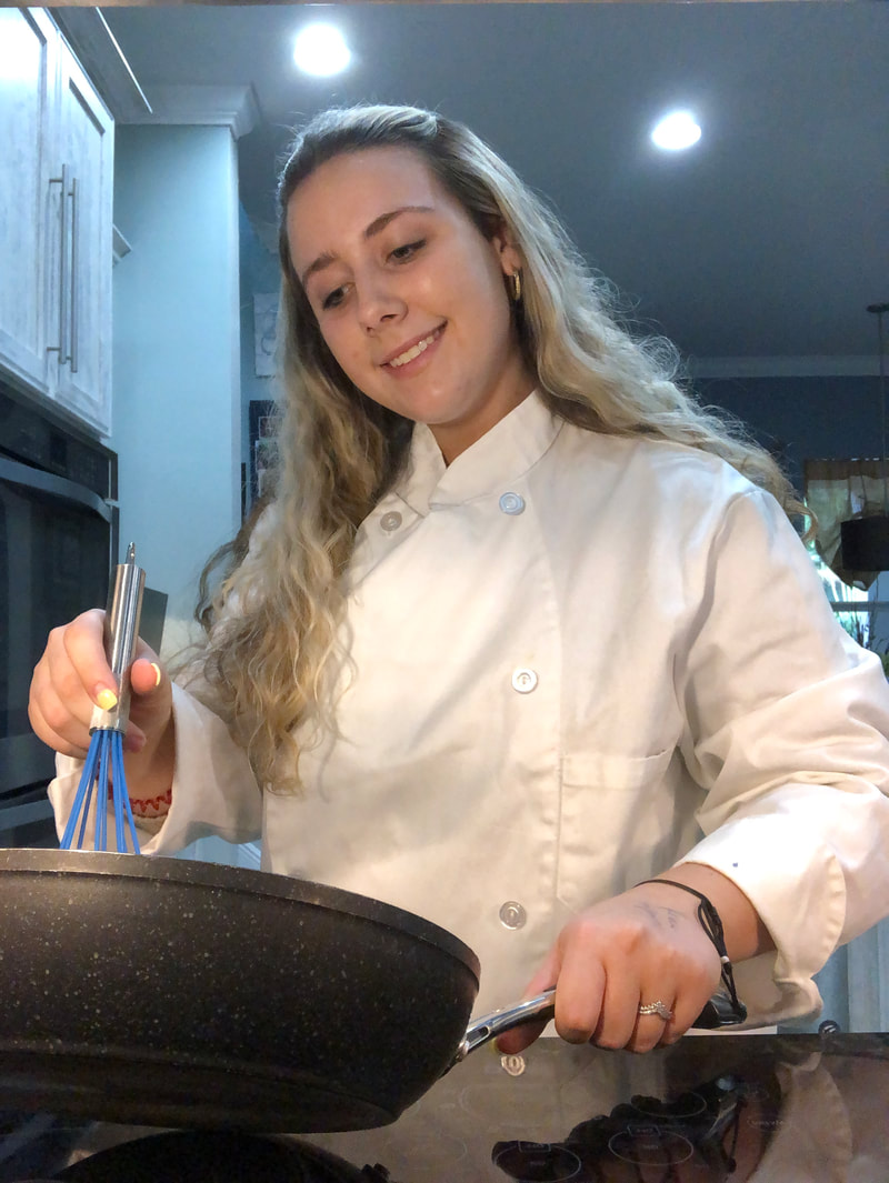
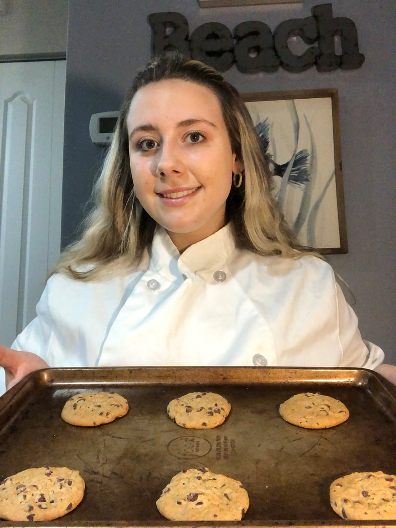
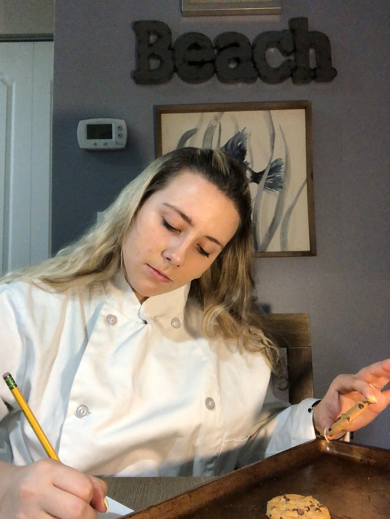
All images were taken by Dennison Trelka (me). Wearing a Brown Shirt:
Action Shots of Cooking:
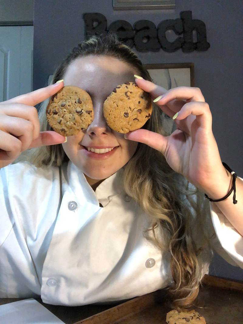
Cook with Cookies:
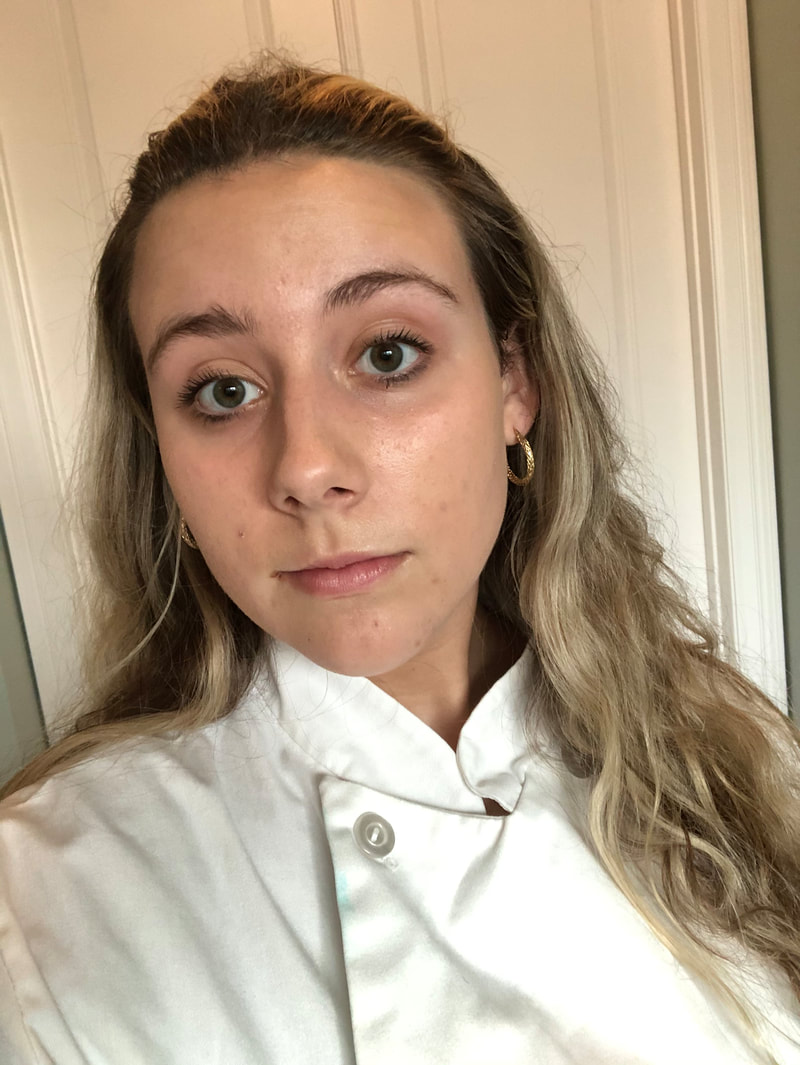
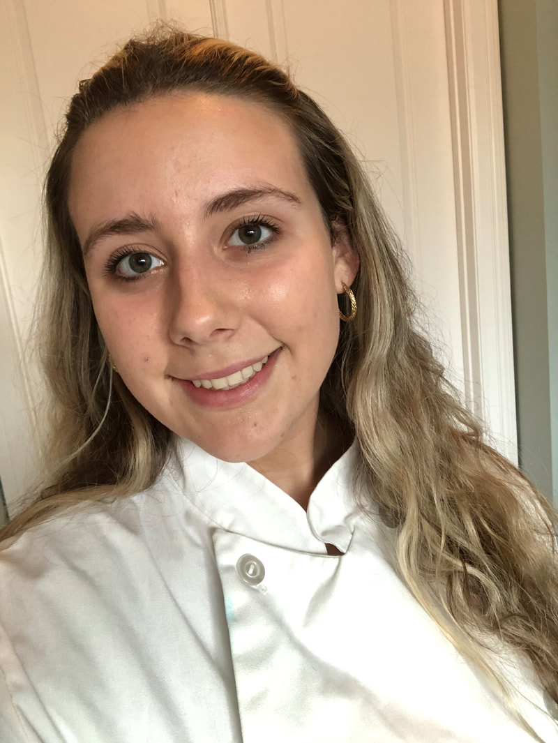
Selfie in the Cooking Jacket:
In this revision I decided to place the images of the food around the perimeter of the table of contents. I did this because I thought the images on the original magazine looked strange only being on the left side of the magazine, and thus thought that there was too much blank space elsewhere. Also, I made the images have a border of the same brown color as the rectangles that encompass the headers of the table of contents, so that the colors matched well. I then spaced the images evenly around the page because I thought that looked better than the original. All the text was the same on the new magazine, however it was spaced closer together and to the right to make room for the images, I believe that this looks more professional. I then added a graphic that Canva offered (Home - Canva) of a pie to fill in the empty space below the final image. On the graphic I added the website URL of the magazine because I believe that that was a fun and creative way to take up space while promoting my magazine's website.
In this revision, I decided to go back to the dark brown and light brown flannel pattern background from the first revision of the table of contents because I believe that that looks the best to match the type of food magazine I am creating. I also changed the color of the rectangles that encase the title of main categories of the magazine to a darker brown so that it fits the color scheme. I then added a dotted line beneath the header "Table of Contents" because I thought that rounded out the magazine and made it seem complete. I finally spaced the leading of the title "Table of Contents" more because I thought it was too close together.
In this revision I changed the background to a darker brown/grey with crisscrosses. I did this to see if the background matches the theme of my magazine, and I think it does. I also placed rectangles behind the heading texts, including where it says "Table of Contents" because I thought that this would make the magazine look more complex and aesthetically pleasing. I then changed the size of the font so that it matched with the new table of contents better.
|
AuthorJust a senior trying to pass the Cambridge exam. Archives
April 2021
Categories |
||||||||||||||||||||||||||||||||||||||||||||||||||||||
 RSS Feed
