In this revision I decided to place the images of the food around the perimeter of the table of contents. I did this because I thought the images on the original magazine looked strange only being on the left side of the magazine, and thus thought that there was too much blank space elsewhere. Also, I made the images have a border of the same brown color as the rectangles that encompass the headers of the table of contents, so that the colors matched well. I then spaced the images evenly around the page because I thought that looked better than the original. All the text was the same on the new magazine, however it was spaced closer together and to the right to make room for the images, I believe that this looks more professional. I then added a graphic that Canva offered (Home - Canva) of a pie to fill in the empty space below the final image. On the graphic I added the website URL of the magazine because I believe that that was a fun and creative way to take up space while promoting my magazine's website.
0 Comments
In this revision, I decided to go back to the dark brown and light brown flannel pattern background from the first revision of the table of contents because I believe that that looks the best to match the type of food magazine I am creating. I also changed the color of the rectangles that encase the title of main categories of the magazine to a darker brown so that it fits the color scheme. I then added a dotted line beneath the header "Table of Contents" because I thought that rounded out the magazine and made it seem complete. I finally spaced the leading of the title "Table of Contents" more because I thought it was too close together.
In this revision I changed the background to a darker brown/grey with crisscrosses. I did this to see if the background matches the theme of my magazine, and I think it does. I also placed rectangles behind the heading texts, including where it says "Table of Contents" because I thought that this would make the magazine look more complex and aesthetically pleasing. I then changed the size of the font so that it matched with the new table of contents better.
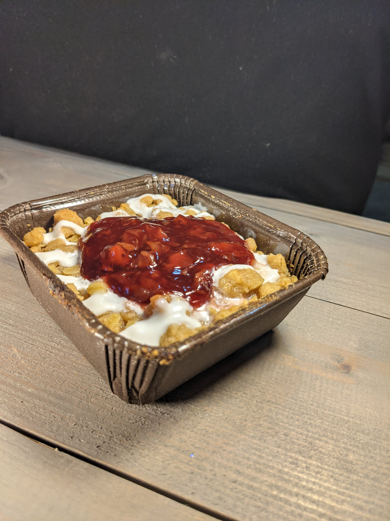
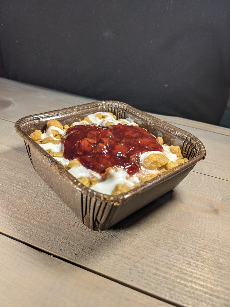
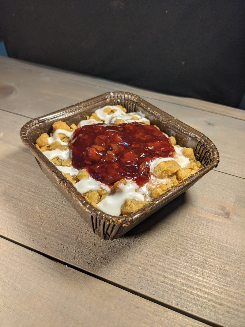
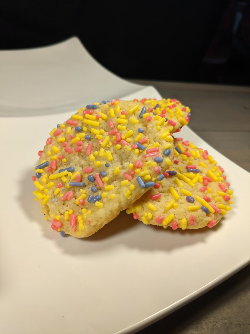
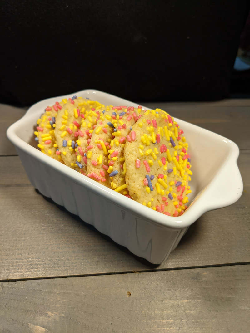
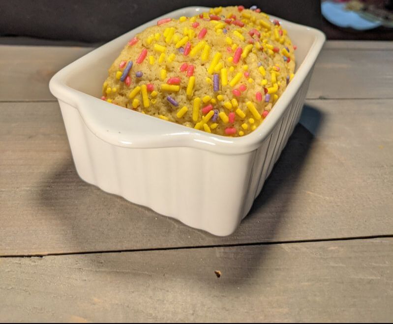
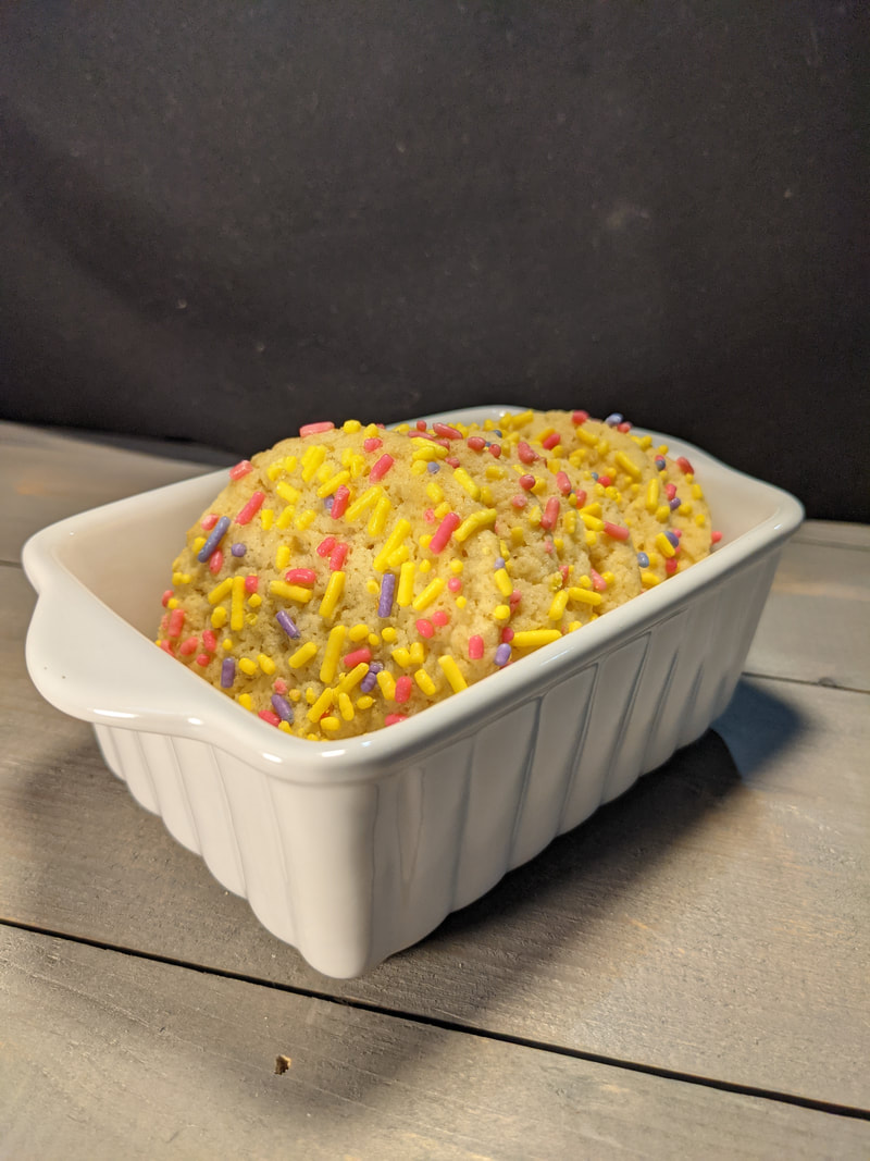
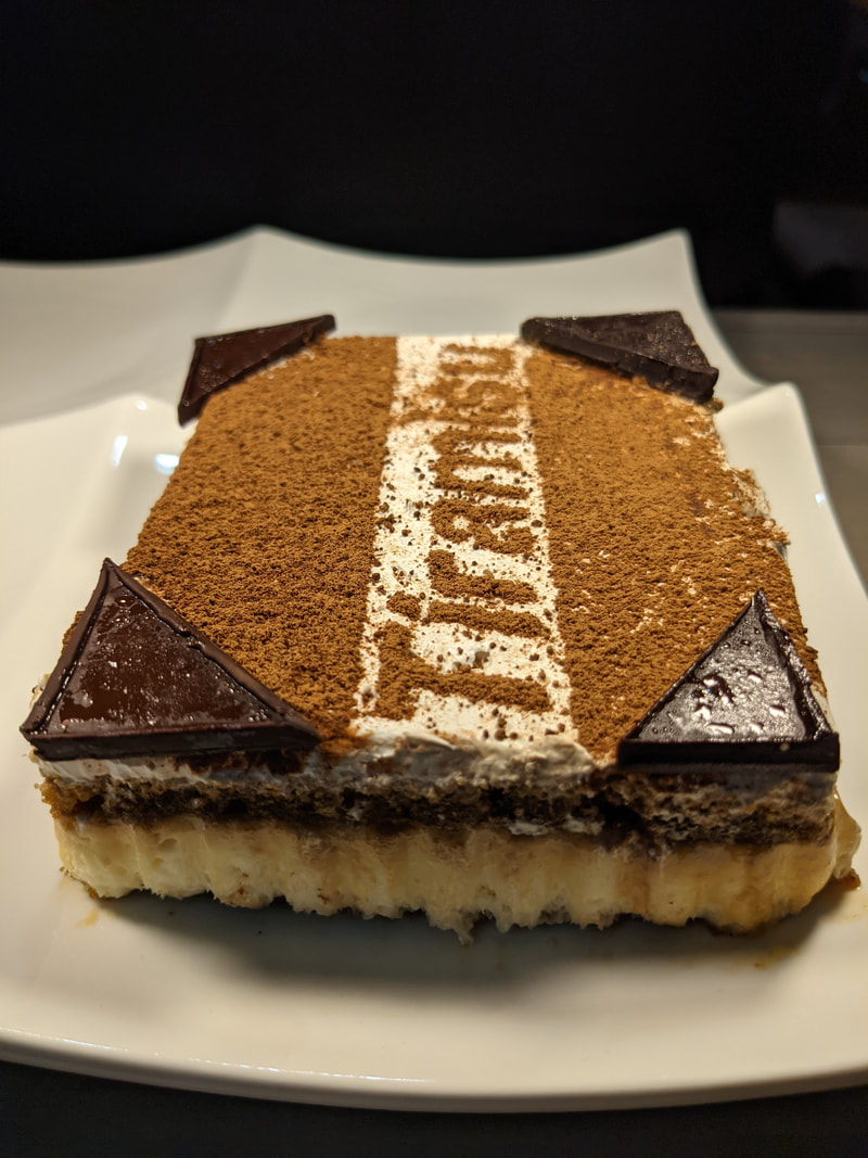
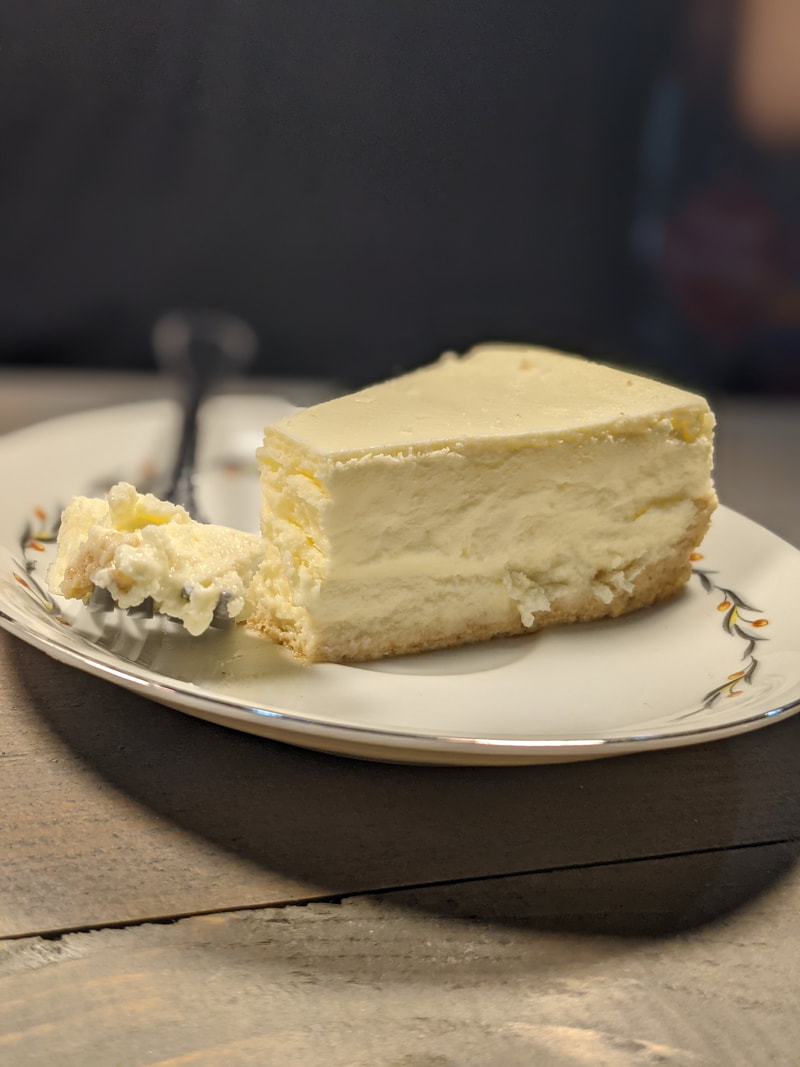
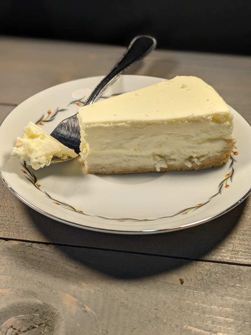
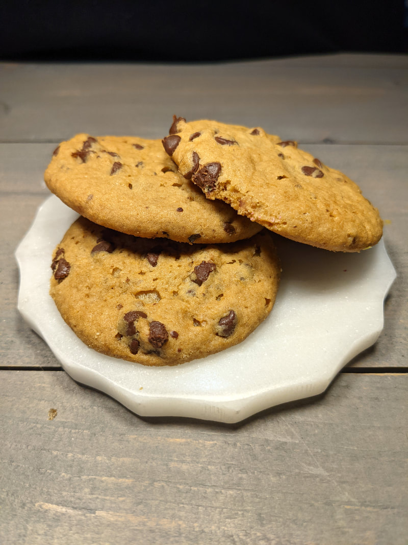
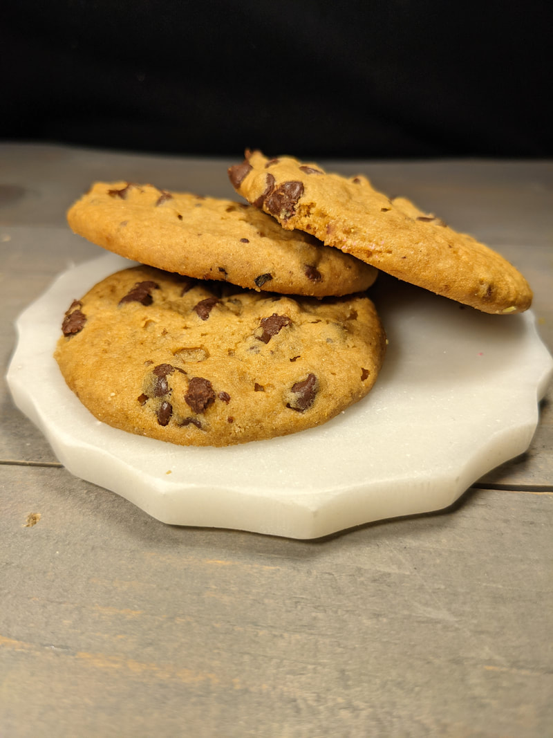
For this revision I changed all the images to the pictures that I took. I did this because I wanted my magazine to look and feel more authentic. In doing this, I had to change the color of the numbers on the images so that they could be seen. I changed the font of the sub-headers because before I though the font looked too curvy, and not professional. I also changed the background images to a kind of dark brown, light brown flannel pattern because I believe this fits the magazine's aesthetic more. Because I changed the background and its color, I had to change the color of the font headers to make it match. I added a rectangle, same color as the font, behind the images to make them stand out. I also changed the font of the sub-headers to make the magazine look more professionally done. I finally shifted the header fonts and colored rectangles to the left to allow for more space for the images. All images were taken by Dennison Trelka (me) with the help of my parents. Cherry Pie:
Sprinkle Cookie:
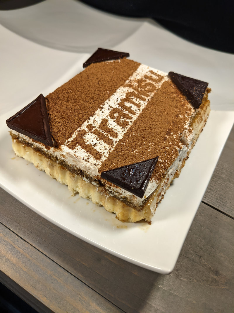
Tiramisu:
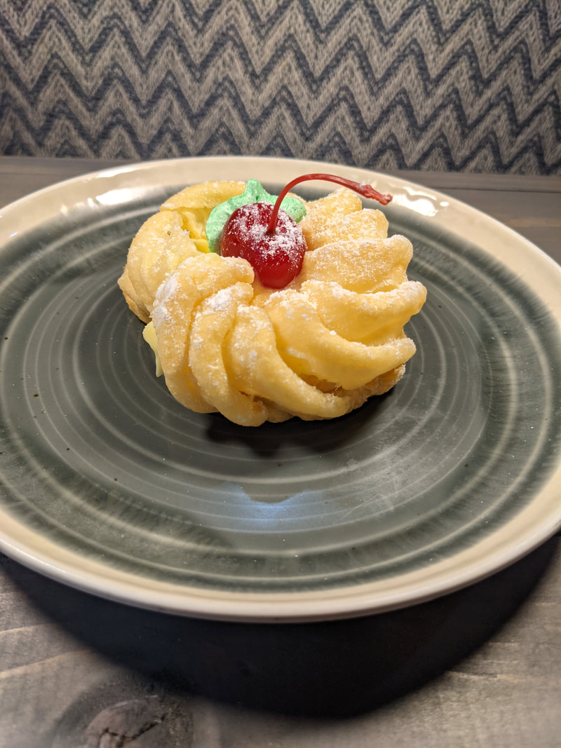
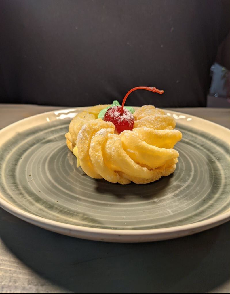
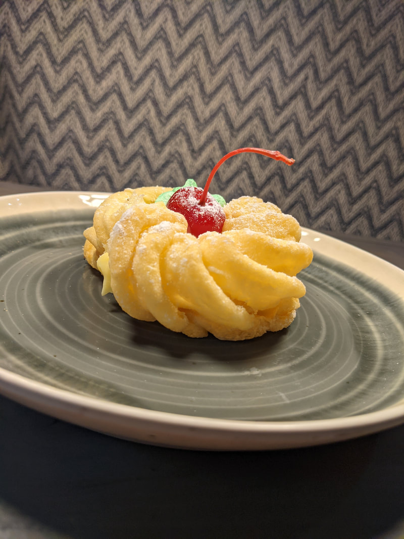
Custard Filled Cruller:
Key Lime Cheesecake:
Chunky Chocolate Chip Cookies:
In this revision, I changed the font, and therefore had to change the alignment and spacing of the font to make it look more professional. I changed the font because I did not believe that it fit the aesthetic of the magazine. I also changed the border color of the magazine to a dark red brown, using the Adobe color wheel, because this looks better suited for the magazine cover. I also changed the inset of Annika Anderson to an image without a filter so she looks real. I finally added an outline/drawing of a cupcake using the Canva website (Home - Canva) because I noticed a large empty space that I believed had to be covered with something, so I chose the outline/drawing of a cupcake because it fits with the content of my magazine.
In this revision, I changed the alignment and spacing of the font to make it more visually appealing. I also changed the border color of the magazine to blue using the Adobe color wheel to see if this color is better suited for the magazine. I also added an inset of Annika Anderson, who was interviewed for the double page spread. I did this because I believe that this makes the magazine look more authentic. This individual is completely fictional and I took an image of myself pretending to be Annika Anderson. I used a filter on the image, and it is very noticeable, so I do not know if this will be sufficient. I am more than sure that I will be changing this image.
In this revision, the only thing I changed was the border color. I changed the color from pink to yellow, using the Adobe color wheel, to see if this color match the magazine better than the pink. I do believe that this look better, but I am still going to experiment with more colors to see if I can find the perfect combination.
In this revision, I changed the background photo to an image of the shiplap wall in my living room and changed the contrast, saturation, and brightness of the photo to make it seem lighter. I did this because I thought the image of the shiplap wall before was too dark, and thus make the magazine cover look dingy. I then changed the border color from black to pink using the Adobe color wheel so that the magazine looks pleasing and matches well because the black did not match the new magazine cover.
With this revision, I realized that I have to take my own photographs. With this in mind, I took an image of my cousin's shiplap wall and used it as the background for my magazine cover. I also changed the border color of the magazine to black so that it matched the over all aesthetic of the magazine. I am not sure if I like this final draft, because I think it looks too dark, so I may make some edits. Finally, I changed the spacing of the articles so that it was not in the dark spaces of the wood pieces, and thus easier to read.
|
AuthorJust a senior trying to pass the Cambridge exam. Archives
April 2021
Categories |
||||||||||||||||||||||||||||||||||||||||||||||||||||||||||||||||||||||||||||||||||||||||||||||||||||||||||||||||||||||||||||

 RSS Feed
