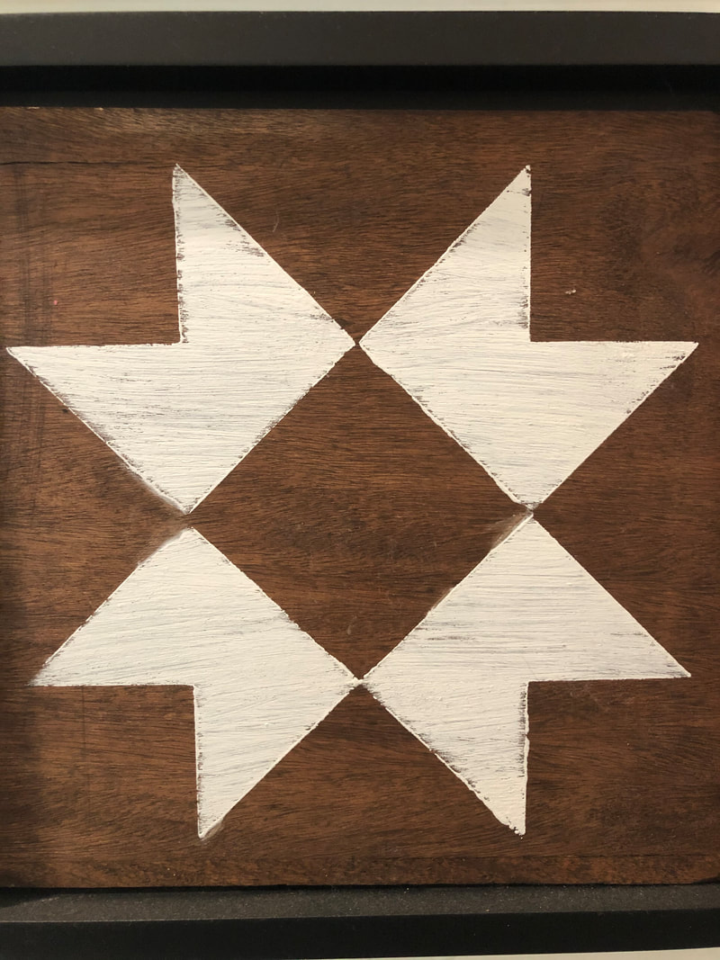
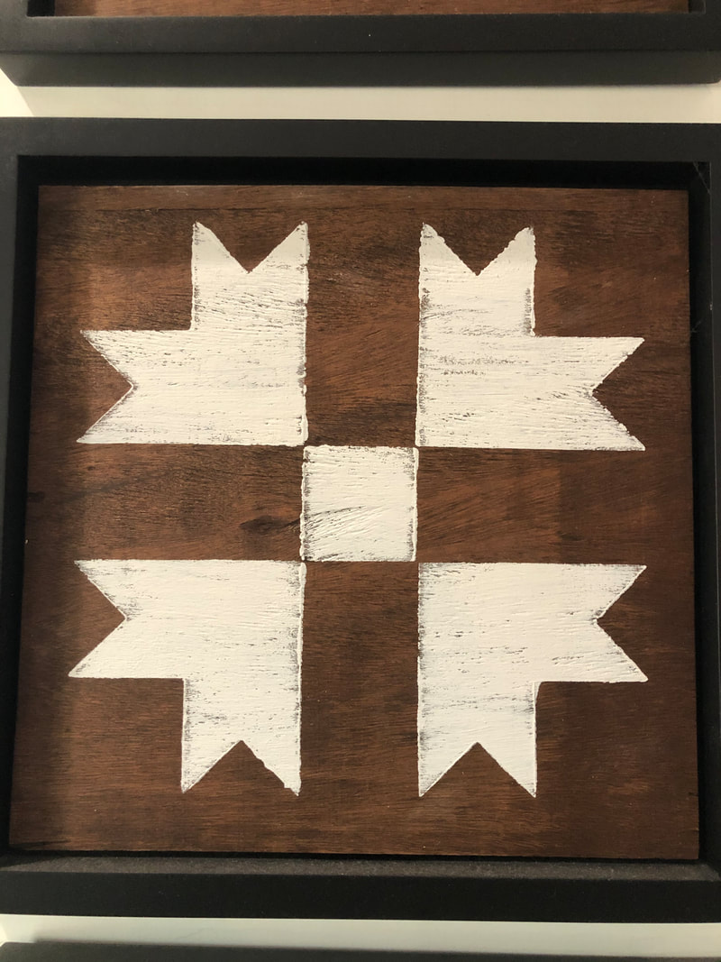
For this revision I changed all the images to the pictures that I took. I did this because I wanted my magazine to look and feel more authentic. In doing this, I had to change the color of the numbers on the images so that they could be seen. I changed the font of the sub-headers because before I though the font looked too curvy, and not professional. I also changed the background images to a kind of dark brown, light brown flannel pattern because I believe this fits the magazine's aesthetic more. Because I changed the background and its color, I had to change the color of the font headers to make it match. I added a rectangle, same color as the font, behind the images to make them stand out. I also changed the font of the sub-headers to make the magazine look more professionally done. I finally shifted the header fonts and colored rectangles to the left to allow for more space for the images.
0 Comments
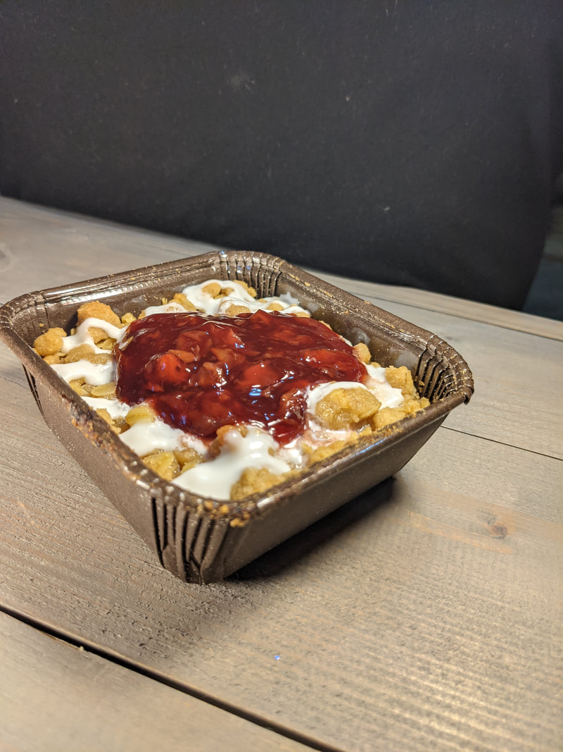
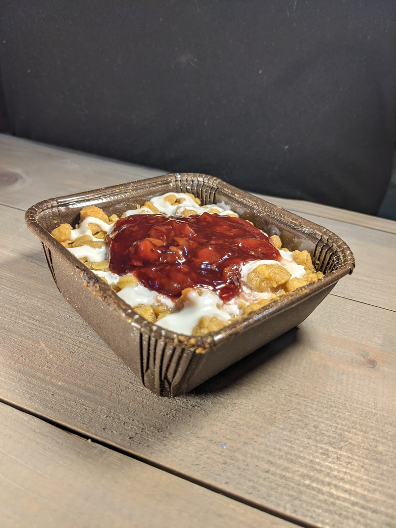
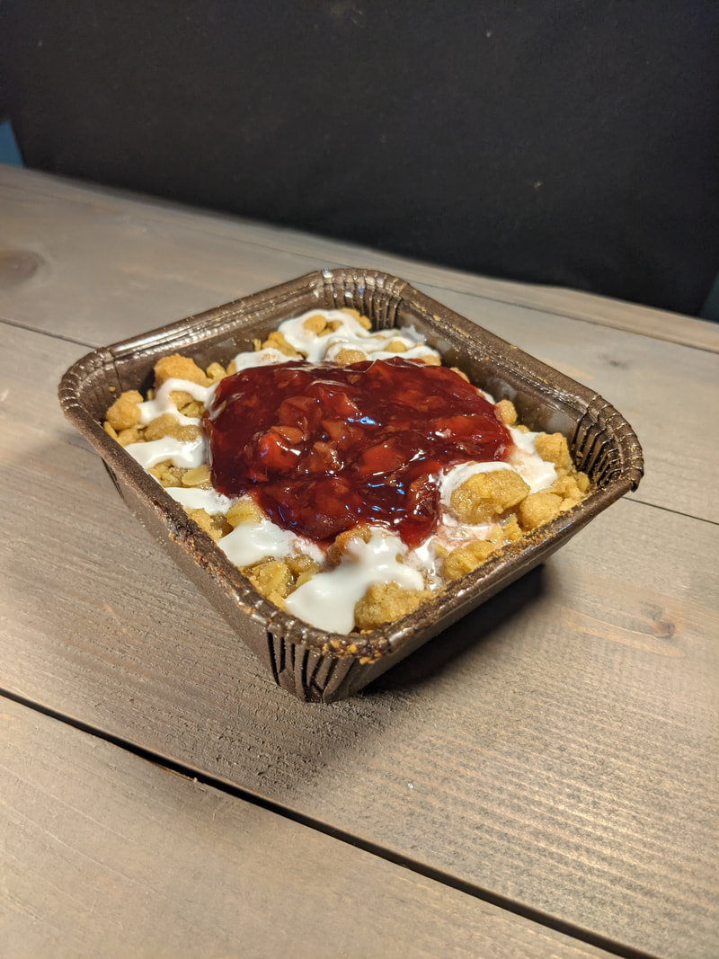
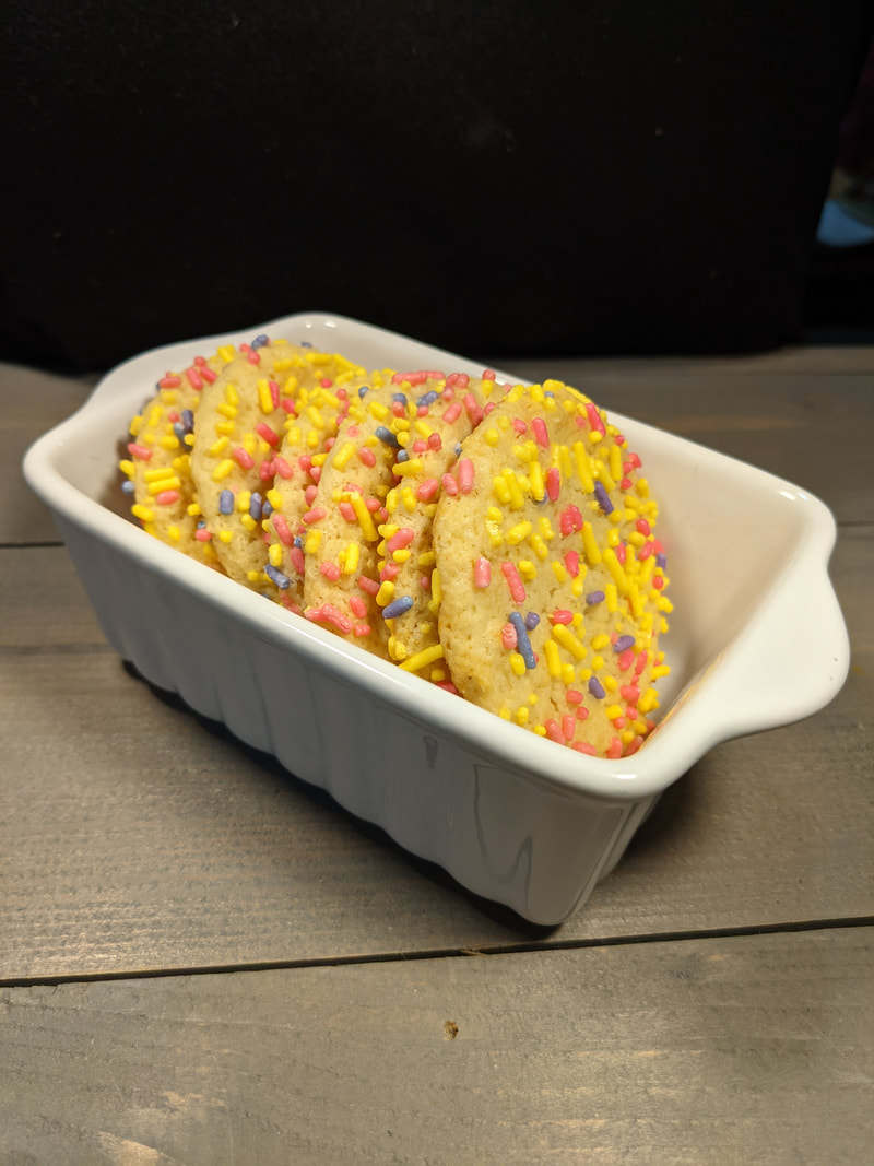
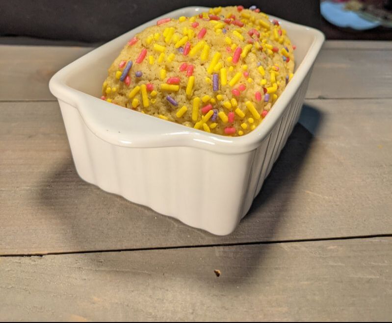
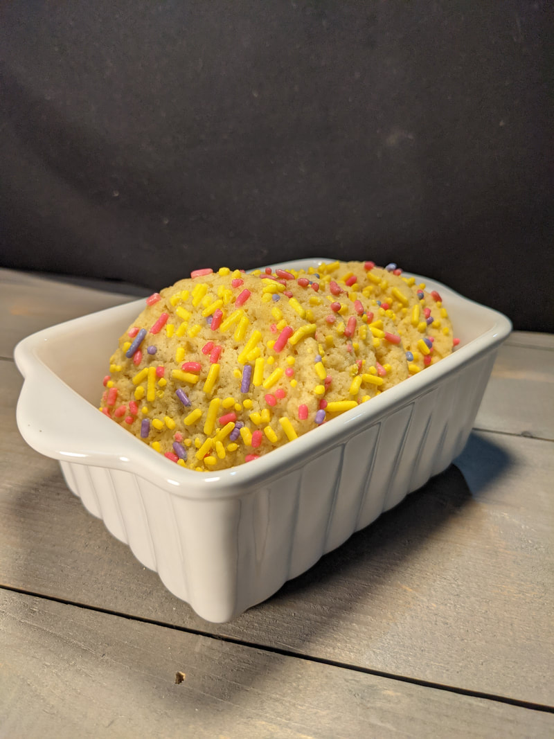
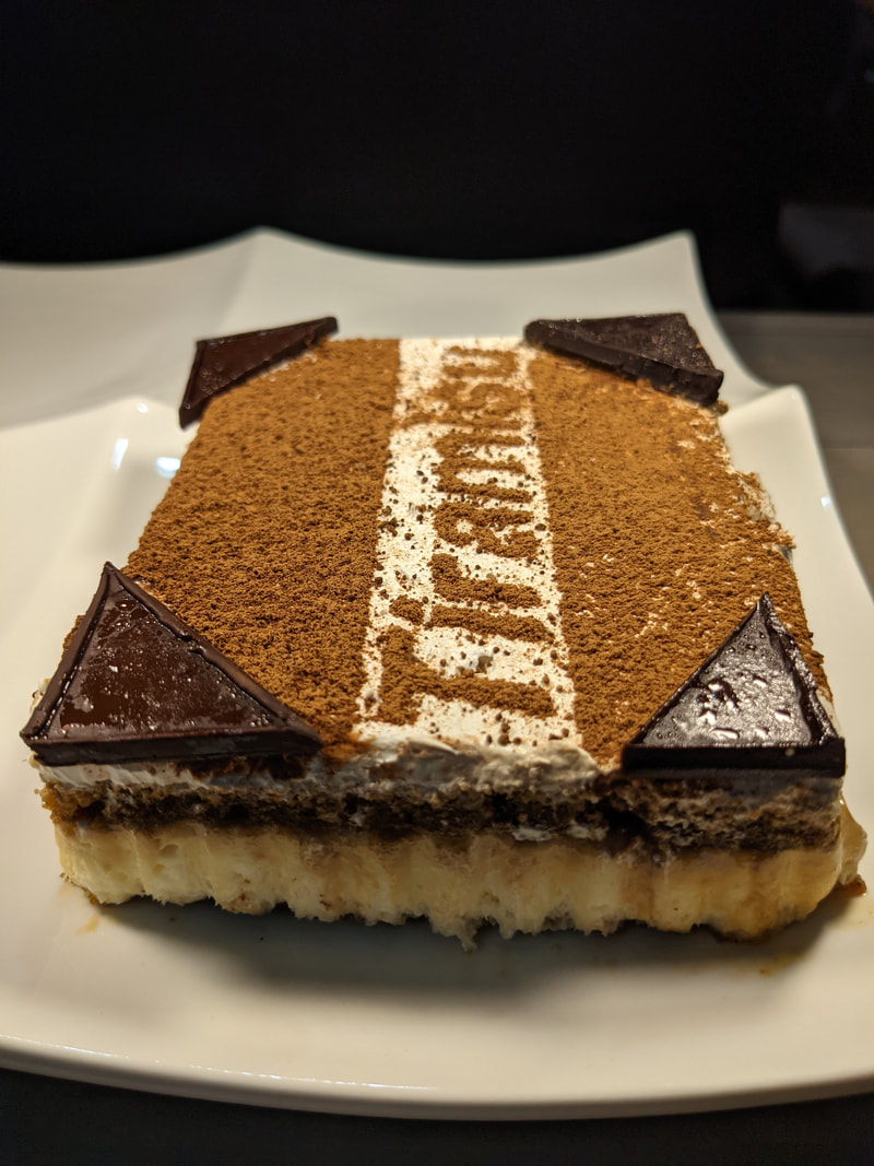
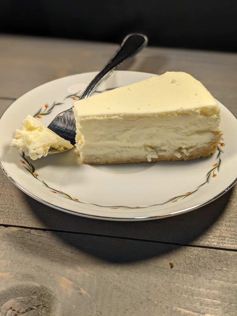
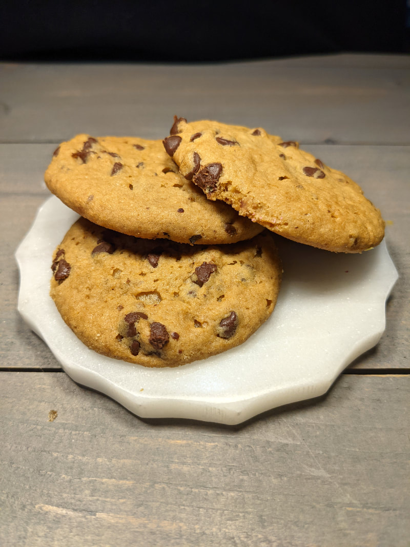
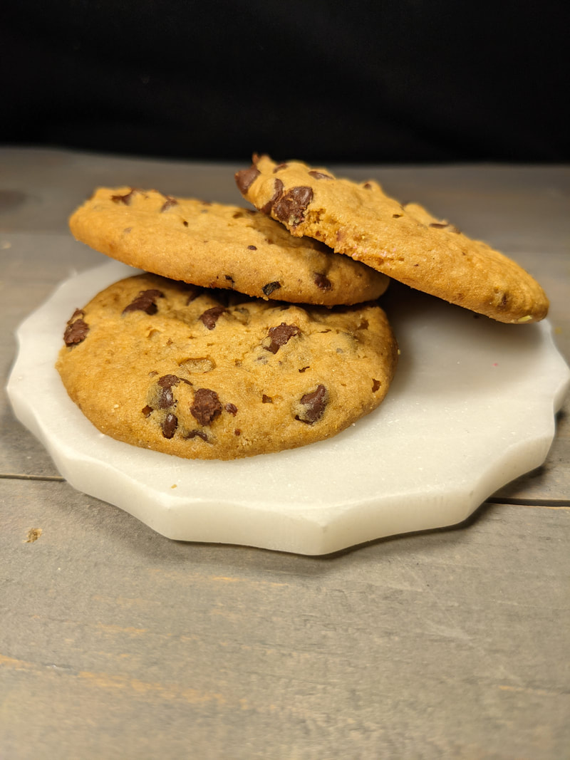
All images were taken by Dennison Trelka (me) with the help of my parents. Cherry Pie:
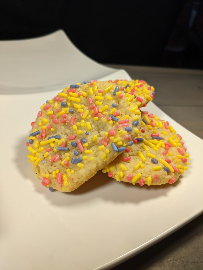
Sprinkle Cookie:
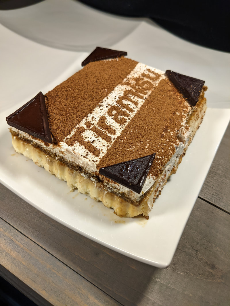
Tiramisu:
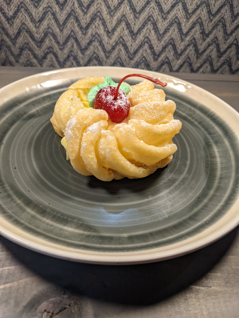
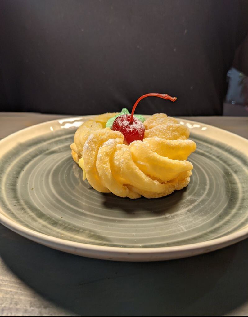
Custard Filled Cruller:
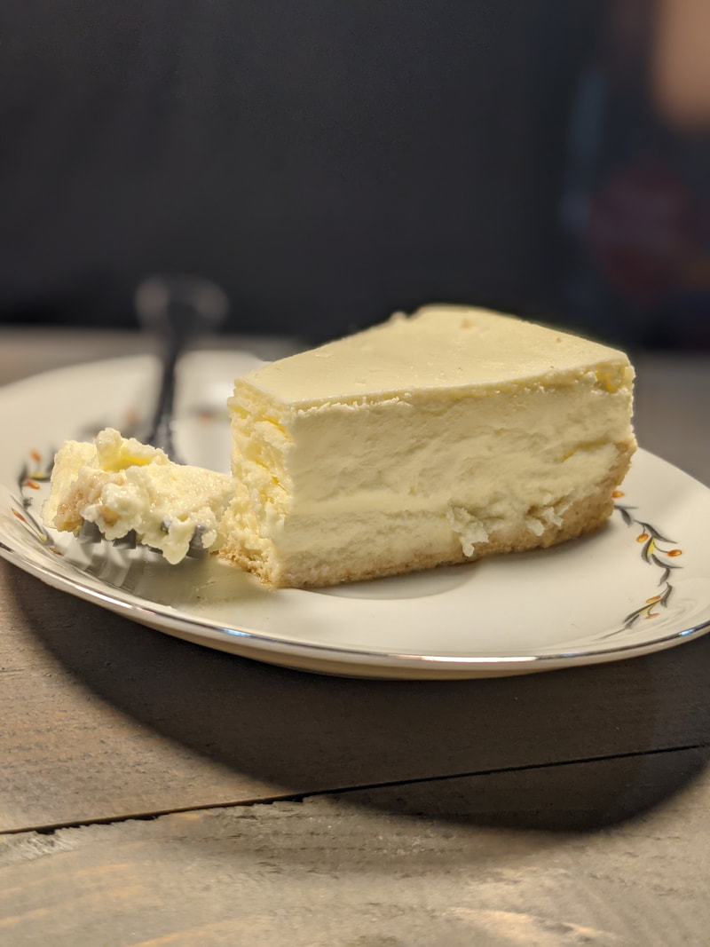
Key Lime Cheesecake:
Chunky Chocolate Chip Cookies:
In this revision, I changed the font, and therefore had to change the alignment and spacing of the font to make it look more professional. I changed the font because I did not believe that it fit the aesthetic of the magazine. I also changed the border color of the magazine to a dark red brown, using the Adobe color wheel, because this looks better suited for the magazine cover. I also changed the inset of Annika Anderson to an image without a filter so she looks real. I finally added an outline/drawing of a cupcake using the Canva website (Home - Canva) because I noticed a large empty space that I believed had to be covered with something, so I chose the outline/drawing of a cupcake because it fits with the content of my magazine.
In this revision, I changed the alignment and spacing of the font to make it more visually appealing. I also changed the border color of the magazine to blue using the Adobe color wheel to see if this color is better suited for the magazine. I also added an inset of Annika Anderson, who was interviewed for the double page spread. I did this because I believe that this makes the magazine look more authentic. This individual is completely fictional and I took an image of myself pretending to be Annika Anderson. I used a filter on the image, and it is very noticeable, so I do not know if this will be sufficient. I am more than sure that I will be changing this image.
In this revision, the only thing I changed was the border color. I changed the color from pink to yellow, using the Adobe color wheel, to see if this color match the magazine better than the pink. I do believe that this look better, but I am still going to experiment with more colors to see if I can find the perfect combination.
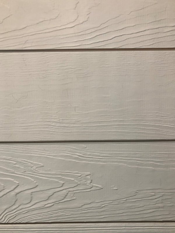
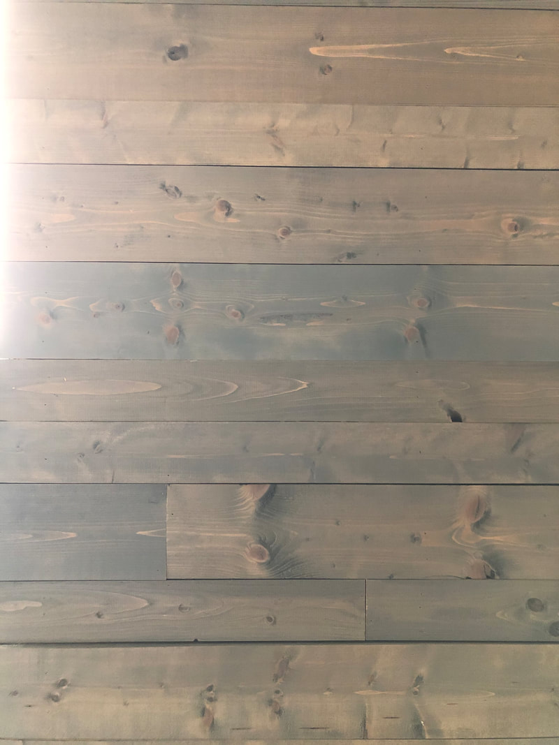
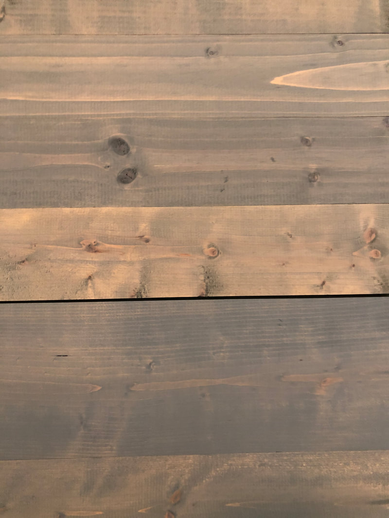
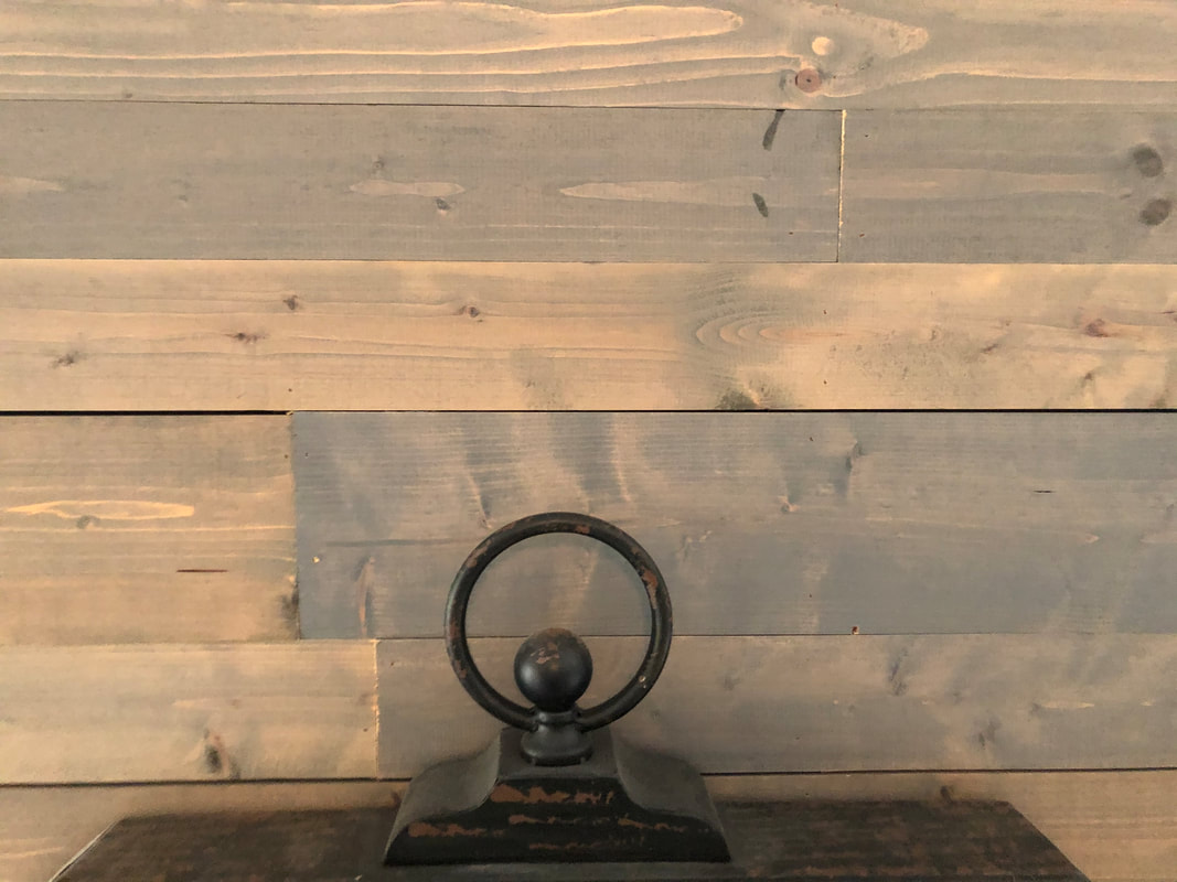
In this revision, I changed the background photo to an image of the shiplap wall in my living room and changed the contrast, saturation, and brightness of the photo to make it seem lighter. I did this because I thought the image of the shiplap wall before was too dark, and thus make the magazine cover look dingy. I then changed the border color from black to pink using the Adobe color wheel so that the magazine looks pleasing and matches well because the black did not match the new magazine cover.
With this revision, I realized that I have to take my own photographs. With this in mind, I took an image of my cousin's shiplap wall and used it as the background for my magazine cover. I also changed the border color of the magazine to black so that it matched the over all aesthetic of the magazine. I am not sure if I like this final draft, because I think it looks too dark, so I may make some edits. Finally, I changed the spacing of the articles so that it was not in the dark spaces of the wood pieces, and thus easier to read.
All images were taken by Dennison Trelka (me).
Film media today is controlled by a few companies who have a stake in what content is streamed and how it is streamed. This is not how it used to be. Forty years ago, independent companies thrived and were more apparent in film media. With all this in mind, there are many issues that are raised when targeting national and local audiences by international or global film media institutions, and among them are the diversity of the content, and marketing.
One issue raised when targeting national and local audiences by international or global film media institutions is the diversity in the content. Conglomerates tend to lack diversity in their films to be safe and to ensure they make a profit. Or, depending on the country from where the film originated, this was what was allowed to be viewed. A conglomerate is a large company that owns many separate companies that sells a large variety of products. With this in mind, a great example of this is Disney, a large cooperation that has acquired many other companies – Pixar, Marvel, and many more -- in order to own or have a stake in all of their creations. Disney is a globally known company that both produces and provides content both nationally and internationally. Because they are known for children's movies, specifically princess movies, they continue to make the same basic movie with different characters and a slightly modified storyline. Disney does this so that they can please their audiences all over the globe and ensure that they make a profit. On the contrary, many independent film media companies tend to have a large amount of diversity in their content. An independent media company is a small group of people who own and produce all of their own products. Now knowing this, we can see that Blinding Edge Pictures is one of these companies. Blinding Edge Pictures is owned by M. Night Shyamalan, and he writes and directs all the films in this company. Blinding Edge Pictures is considered a small player in media because it only produces films written and directed by M. Night Shyamalan. Blinding Edge Pictures produces and provided content both nationally and internationally, and because Blinding Edge Pictures is an independent media company that wants to push the boundaries of the expected ending in movies, they tend to create films that have twist endings to make the audience shocked after viewing the movie. Blinding Edge Pictures does this because they tend not to care what the audience preferences are, and because of this, they can produce whatever they want. The next issue raised when targeting national and local audiences by international or global film media institutions is marketing. In today’s world, marketing is everything. We tend to buy and watch more things that are marketed often, and globally known companies do this all the time. No matter where you are in the world, rural or urban, if you have a television or a store chain near you, you have seen films marketed and advertised. Disney and Blinding Edge Pictures both promote their films via advertisements. Disney will pay millions upon millions of dollars to have commercials of their new coming films on cable, streaming services, and in movie theaters, while Blinding Edge Pictures only pays for commercials for cable and the movie theater. However, depending on the company, you may or may not see the commercials often. With large conglomerates like Disney, they have the funds to have the commercials for their movies play on repeat. However, with smaller independent companies like Blinding Edge Pictures, they do not have the funds to have their film advertised often, and because of this, it tends to be limited to some audiences. In conclusion, there are many issues that are raised when targeting national and local audiences by international or global film media institutions, and among them are the diversity of the content, and marketing. As we looked at Disney and Blinding Edge Pictures, we gained a better understanding of how targeting local and national audiences differs between conglomerates and independent film media companies.
For this revision, I decided to go with a homey, rustic look. I changed the background from white to light brown and peach stripes because I thought the white looked too plain and empty. I also changed the font and font color because the original blue and pink lettering did not match the overall theme of the revised table of contents. Not only that, but I also did my best to evenly space out the names of the articles because on the original table of contents, it looked uneven and messy. All the images I used came from the Canva (Home - Canva) website and are currently being used as place holders until I can go to the store this weekend and make some of the desserts and so that I can take photographs of them. I changed the colors of the rectangles to a dark brown red because I thought this matched the background image better than the purple color. Finally, I changed the placement of the numbers to the upper right-hand corner, and I changed the color of the numbers to all black so that they were uniform.
|
AuthorJust a senior trying to pass the Cambridge exam. Archives
April 2021
Categories |
|||||||||||||||||||||||||||||||||||||||||||||||||||||||||||||||||||||||||||||||||||||||||||||||||||||||||||||||||||||||||


 RSS Feed
